The goal of this project was twofold - 1) To upgrade and migrate portfolio creating and editing capabilities to the new angular platform and brand identity 2) To offer users the added functionality of creating blended portfolios.
What are blended portfolios?
Typically, Advisor Center portfolios comprised of stocks, bonds, ETFs or a combination of these. Blended portfolios allow financial advisors (our primary users) to use any combination of funds, previously saved portfolios and/or BlackRock models to create a portfolio. Essentially, we were adding the ability to mix and match more than one type of ingredient in a portfolio construction user flow.
Why the need for blended portfolios?
Due to the integration of Advisor Center into third-party financial planning softwares, which is a big part of our revenue stream, the team was anticipating that new users would need this capability to securely import blended portfolios from those external softwares into Advisor Center or create within Advisor Center to export out. In order to let users get a complete portfolio construction experience, the business decided to invest in filling that gap.
The introduction of blended portfolios, which allowed the use of BlackRock models, was also a big commercialization opportunity – an important design goal for the year 2020.
MY ROLE:
Vice President, Interaction Design for Advisor Center, leading end-to-end user-experience, including hands-on UX design, visual design and user testing, partnering with product and engineering leads.
MEASURE OF SUCCESS:
% of blended portfolio created.
% of blended portfolios using BlackRock models.
Assessment of Existing Tool
What was wrong with the existing tool and why we couldn’t just ‘enhance’ it?
Within our universe of tools across the firm, only 2 applications offered the capability to create/edit portfolios. One of them was our tool in Advisor Center (AC), the other one was an enterprise product built and used specifically by a limited numbered of fee-based clients. Which means it had particular use cases catered to a particular type of user segment, a lot of which we could not reuse, even in the interest of scale and efficiency.
The dev platform was changing and using a wider grid and a new brand identity, which required all active tools to update to a new look and feel
Metrics we used as benchmarks were:
AC users had created 29,000 portfolios using our tool in the last 6 weeks
Feedback that came via our sales reps (our secondary users) indicated that users were annoyed by the amount of error messages that kept popping up while creating portfolios
40% of portfolio creation flows started by users importing holdings from an excel document


Interaction Explorations
There were a lot of elements of the original design that I decided to retain because our users were successfully using them without an issue, so unnecessarily innovating could cause a steep learning curve. The portion that needed the most trial and error was showing the hierarchy within the portfolio and allowing discoverability of the new ‘ingredients’. I tried a couple different approaches to showcase the blended nature of a hypothetical portfolios.
Option 1
Show a list view with indented items for parent, children and grandchildren and allow in line editing

Cons:
Inline editing of children and grandchildren doesn’t allow for subtotals to show. Users may get confused between contributing weight of child to parent vs total wait of child from grandchildren. Example: In above image the three grandchildren add up to 100% but in this view the Child Portfolio Blend shows a 50% weight, because when the child was added it was only allocated 50% of the parent.
Option 2
Show a diagrammatic view of all ingredients to visualize hierarchy, and allow actions for each ingredient.

Cons:
Because of the flow-chart-like approach there could be a long scroll (vertical and horizontal) once all ingredients are added, since users can add up to 100 ingredients.
The sheer amount of colors needed to depict each ingredient is not something our color palette could provide.
Option 3
Show all ingredients in a list view same as Option 1, but only allow inline editing of child weights. All other editing is done in a modal so user can provide individual attention to each child and its ingredients.


User Testing & Socialization Round 1
My Product manager and I tested these three versions with our secondary users, our sales representatives, for faster access to test users, and also socialized with out larger product management and engineering team. Option 3 was the most popular one, easier to understand and build compared to the other 2. Some concerns that were still looming were:
“I don’t think users will know they can add more than just funds”
“I don’t think users will know how to edit weights, we should add persistent input fields”
“I like how clean it is, not sure if advisors will understand what ‘blend’ means”
It seemed like ‘discoverability’ of the addition functionality was the main underlying concern in all these comments. I assured the team that the next round of design will be tested with primary users in a usability testing format (instead of concept testing), and these concerns will be addressed.
Design Updates
In addition to feedback addressed from the first round of testing, I proceeded to also work through multiple use cases and edge cases, as well as addressing the appearance of various stages of errors and how/when they will pop up. For example:
In-line Alerts
Pop up when user finishes inputing a line item, the tool instantly validates it and spits out an error if necessary
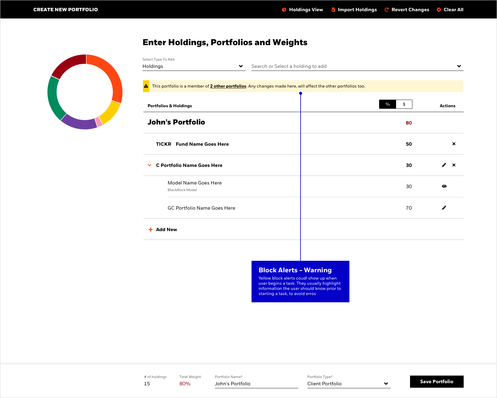
Block Alerts
Appear when user has finished adding and editing ingredients, clicks on the save button. the tool validates whether all minimum requirements have been fulfilled and then shows appropriate message
Semantic Indicators
Persistent but subtle. Use a semantic color (most often red) to highlight where an error could occur.


Usability Testing and Key Takeaways
Once the tool was coded and the core functionality was ready, I screened test users, wrote test script for and ran 8 usability tests with financial advisors.
8/8 users were successfully able to discover various types of investment ingredients from the top menu and add it to their portfolio.
Average time to discover and add 3 ingredients = 1 minute 7 seconds8/8 users were successfully able to allocate weights to, edit and view holdings of children and grandchildren ingredients.
3/8 users couldn’t locate the 4th ingredient after it was added, because it was hidden behind locked footer. - recommend exploring auto-scrolling of ingredient list
Top menu was used more than bottom menu - recommend keeping an eye on real-time usage with portfolios with 10+ ingredients
Users didn’t know what ‘holdings’ meant - recommend switching to funds/stocks
The term ‘blended portfolio’ was not entirely clear to some users - recommend finding an alternative term
Metrics

The total number of portfolio created was the same as in the old tool, which tells us that the new design in no way hindered the capability of creating portfolios which is great. Users were importing portfolios from excel more than before, despite the significant UI hierarchy change.
What is not so great is that only 1.5% of those portfolios were blends. User were not using more than 1 investment ingredient still. However most of those blends included a BlackRock model, which could mean that those users preferred using models than saved portfolios., something that could bring insight into portfolio construction trends. The integrated users from the 3rd-party parnet whom this functinlaity was originally for, hadn’t been onboarded by the time these stats were collected. Could that onboarding possibly affect these numbers? We’ll have to wait and watch.
Next Steps
In the meantime, in order to understand why legacy users weren’t creating more blends, the team and I are exploring the following next steps:
Creating educational/tutorial content around blending, and when/how to use it. We are hoping to learn whether a) the user knows he/she can blend but its not something they find useful or b) they want to blend but don’t realize that the functionality exists in the tool
Promote the tool’s new functionality via marketing campaigns
Have our sales reps demo the functionality to advisors and show them how it works
(Do not save, download, copy or share this content without prior permission)