In early 2018 BlackRock launched 2 tools (in addition to 2 already launched in 2017), 360˚ Evaluator 1.0 and Peer Comparison. The biggest business issue was that 360˚ Evaluator 1.0 did not have a clear value proposition, at least not one that financial advisors (our users) were able see. They were still using multiple tools from multiple sources to create one client-friendly report. The biggest design issues were that these tools were built in silos by different product teams and different designers, with no foundational design thinking and no coherent user experience connecting them. My job was to lead a now dedicated design team to evolve these tools individually, as part of a suite as well as for future third-party integrations, in order to achieve the annual goal of collecting 25,000 portfolios in 2018 and deepen engagement in 2019. By end of 2018, with the product updates made, Advisor Center had surpassed it’s goal and collected 58,000 portfolios.
MY ROLE:
Vice President, Interaction Design for Advisor Center, leading end-to-end user-experience, including research, design and testing, across all tools alongside a reporting designer.
MEASURE OF SUCCESS:
Deepen engagement (get repeat users in Advisor Center)
Where we started:
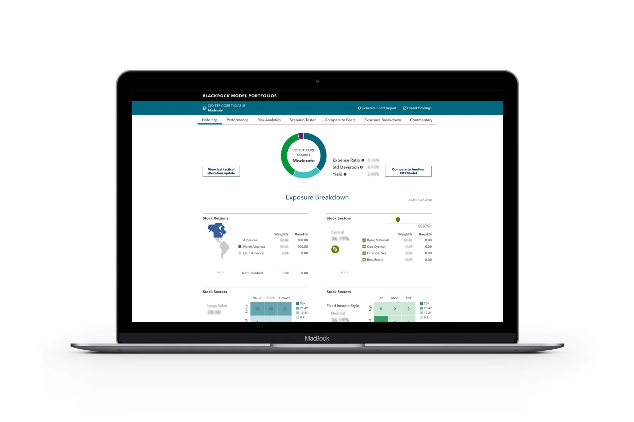
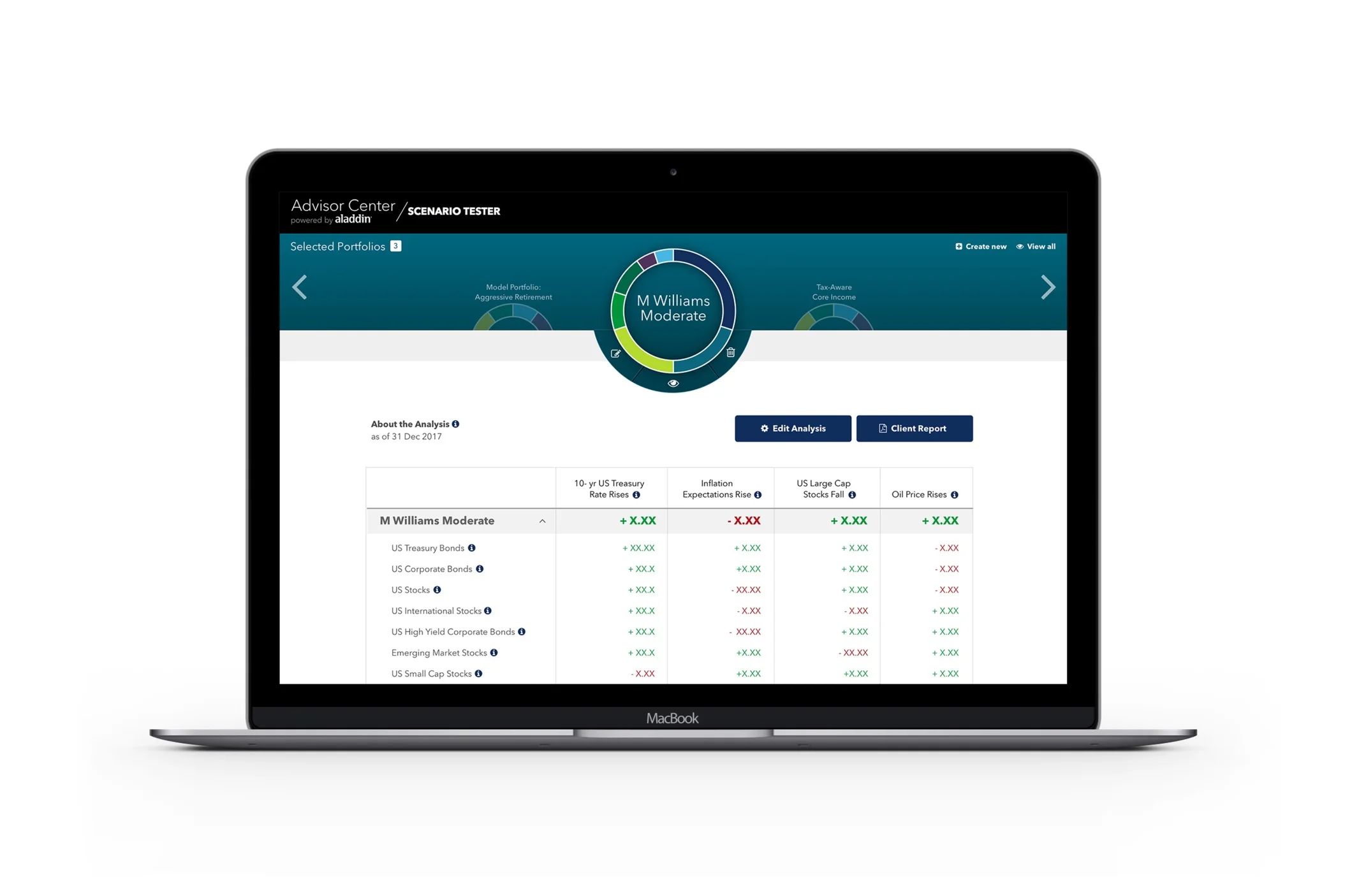
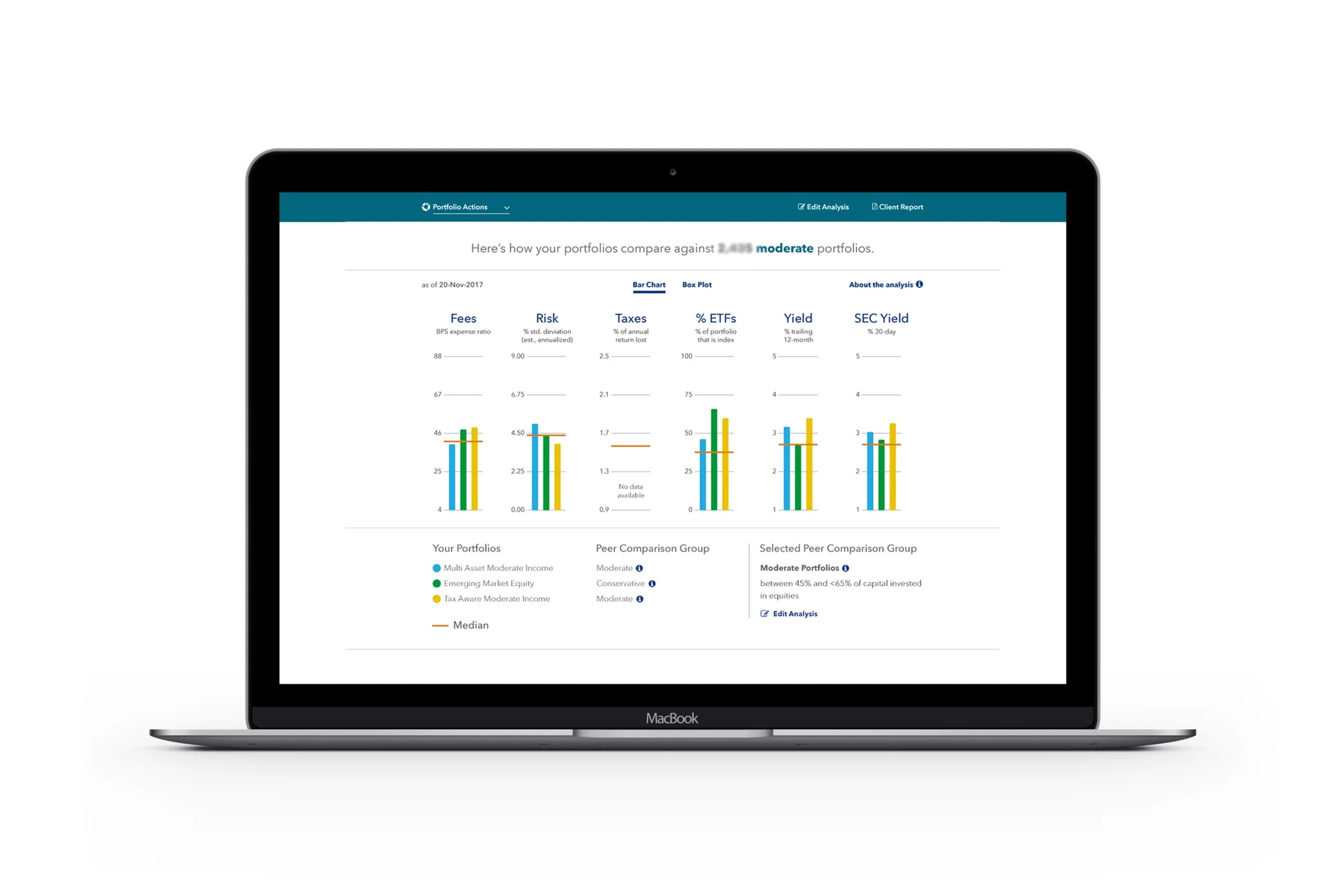
L–R: 360˚ Evaluator 1.0 (launched spring 2018); Scenario Tester 1.0 (launched fall 2017); Peer Comparison (launched spring 2018)
Research: Step 1
To recognize the potential that Advisor Center tools had, I started off by conducting a competitive and market research, a step which was rushed through or omitted at the beginning. The 2 new and big competitors identified were the JP Morgan’s Portfolio Insights tool and Riskalyze. The Portfolio Insights tool was a lot like 360˚ Evaluator but with benchmark comparison and the Riskalyze used a Risk Score, derived from a robust onboarding questionnaire, that helped advisors prospect new clients. After doing a few brainstorming sessions with stakeholders, it was agreed upon that it needed to put more focus on not only generating better portfolio-specific insights, but also helping advisors understand these analytics and convey them to their clients in a very simple manner. Another edge BlackRock had over its competitors was unique view on risk thanks to its trademark Aladdin Risk platform. Together, it was the power behind 360˚ Evaluator 2.0. It would also have lite widgets of Scenario Tester (existing) and Peer Comparison (new).


Research: Step 2
To make sure we were designing for advisors we understood, I decided to validate our personas. To begin, I collected questions for various members of the team (PMs, Designers, Stakeholders, etc.) that were generated keeping in mind what they don’t yet know about the advisor, or what new information do they need based on the roadmap of products ahead. The final set of questions was created from an affinity map of all the collected questions. After that, I gathered answers from interviews conducted in the year prior, interviews conducted by other product teams for their advisor-focused tools, and more interviews with our sales leaders who talk to advisors on a daily basis. We landed up with 5 personas. These 5 distilled down to the 3 overarching personas but with plenty of new detail.

Affinity map of interview questions
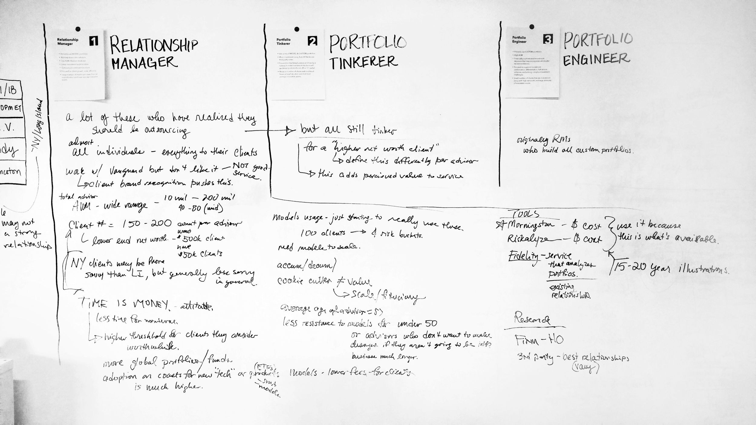
Whiteboarding session analyzing interview results
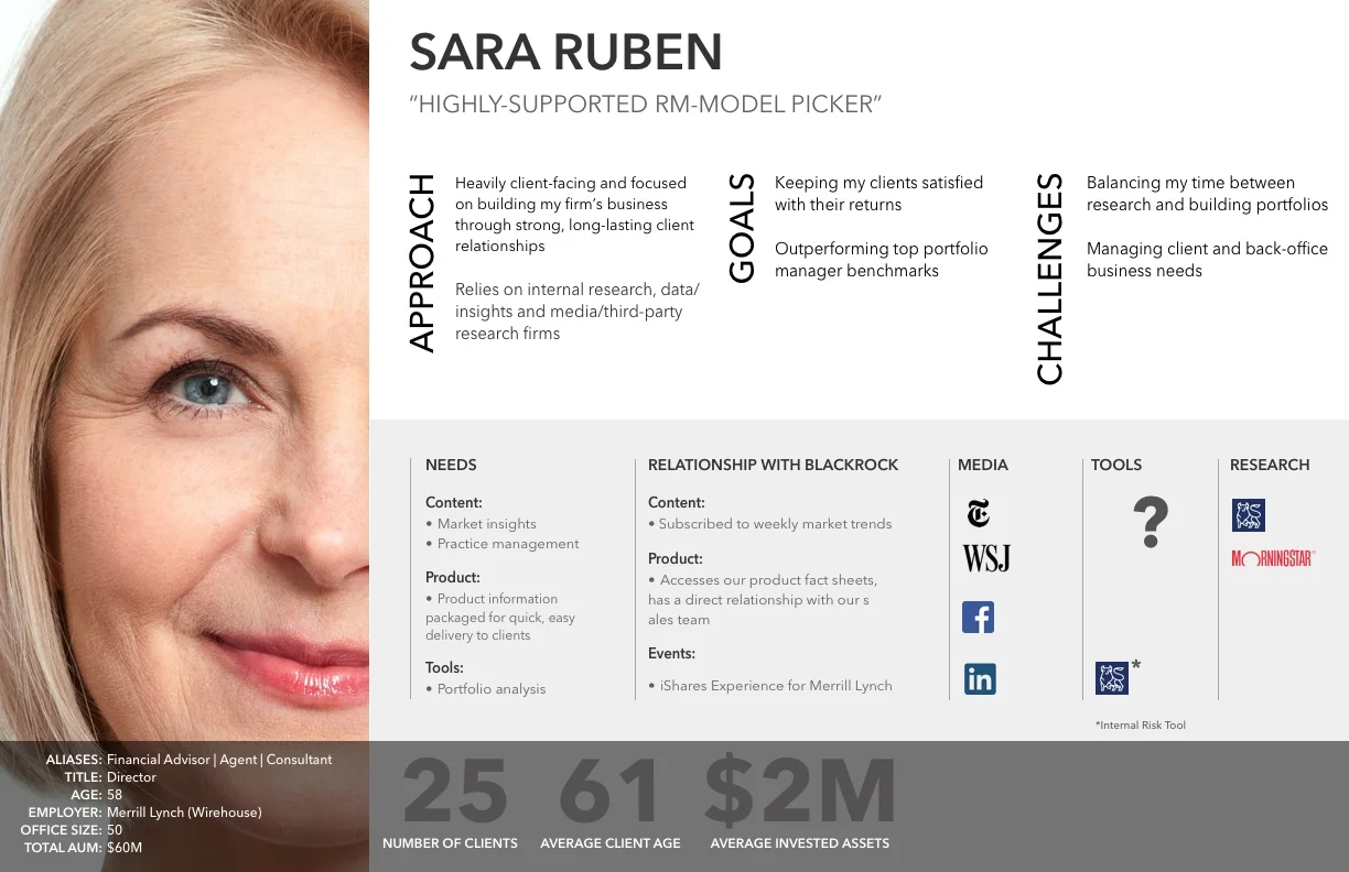
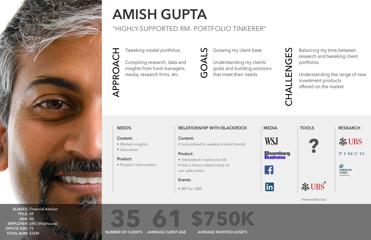
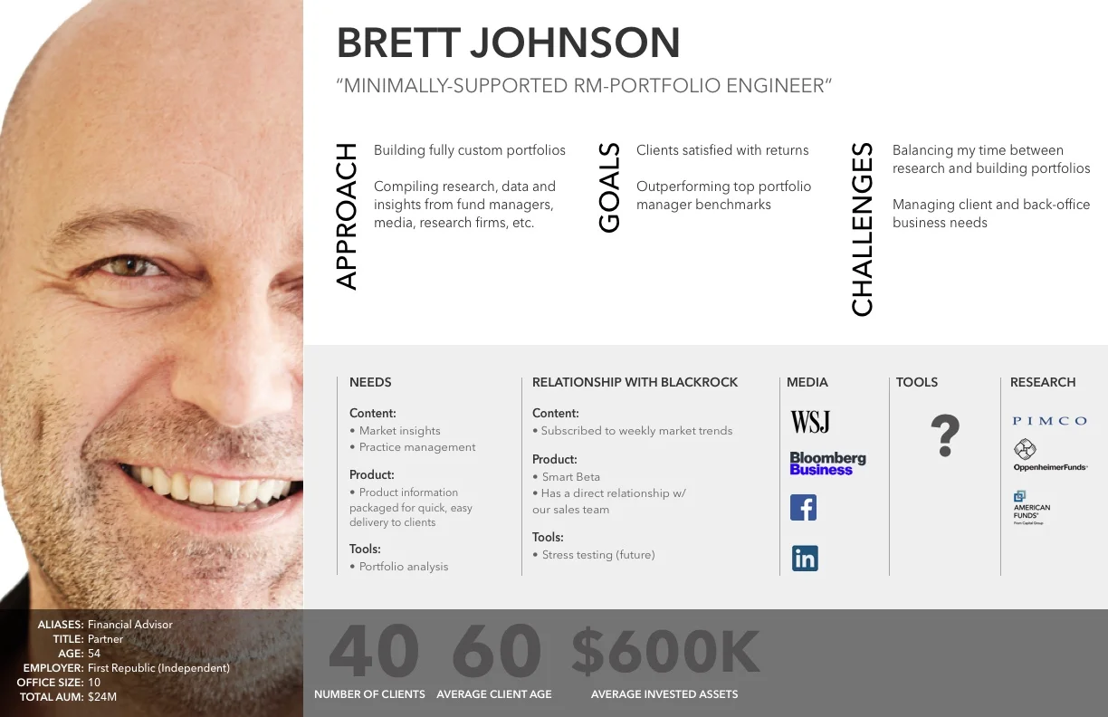
The Personas
Concept Test
While the product team researched data sources and APIs, using these personas, we wrote user stories and designed a concept version of 360˚ Evaluator 2.0. A concept test with 7 advisors was our final attempt to validate the feasibility of this tool before beginning the build.
The tests for 2.0 resulted in an overall positive response, with advisors claiming the new set of analytics, insights, risk and UI proving to be very compelling. The fact that it was all offered for free was a bonus. They also gave us specific feedback on how to improve some of the analytics to be more in line with changing market events.
“How do I compare two portfolios?”
“I especially like the risk decomposition section but I’m interested in knowing how active risk is calculated”
“The interface is beautiful but this is a lot of new information.”
Some quotes from the concept test. The second one was a repeat offender (for various factors) which facilitated the use of info icons to show detailed definitions and methodologies.
Design & Build
BlackRock’s decision to adopt a new brand identity in 2018 proved to be a blessing in disguise for us. At first what seemed hard to achieve helped us build a design system, based on the brand’s core values full of new text styles, buttons styles, component styles, etc. paving way to streamlining any UI inconsistencies that were a product of disconnected designers.
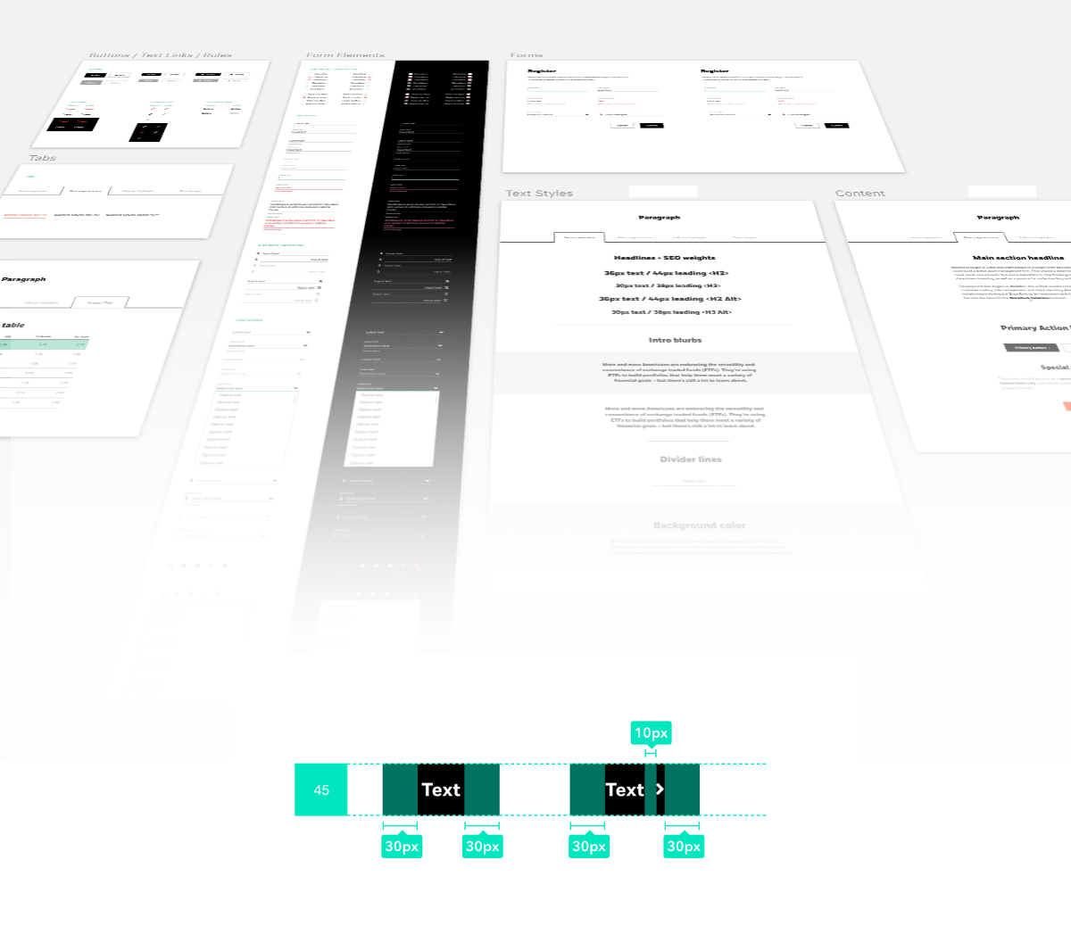
Each element in the design system is made carefully to spec and its interactive behavior is documented in a style guide for every designer to follow.
We also conducted a quick open card sorting exercise with 16 users to inform the new navigation within the tool, because we now had way more components (analytics) than 1.0 and hence the need to organize them efficiently was high.

Stages of Design
1.0
Starting state. 10 components, no design system, single page scroll.

1.5
Concept state. 17 components, new design system WIP, new nav pre card-sort

2.0
The 360˚ Evaluator 2.0 was now bigger (17 components = analytics),
new VI and design system (UI consistency across tools) and user-centric (distilling complex insights into plain English)

360˚ Evaluator 2.0 - Portfolio Characteristics

360˚ Evaluator 2.0 - Portfolio Specific Insights
User Testing
We ran qualitative user tests with 11 advisors from various segments of the industry.
A strong majority of advisors said they would be likely to use 360 Evaluator as a part of a monthly or quarterly process of checking in on their own portfolios. A majority also said they would use 360 Evaluator before and in client reviews. Nearly 50% said they would use it as a tool for prospecting and investment proposals. 75% users requested to make the client-ready proposal shorter than its current 18-page length.
360˚ Evaluator 2.0 launched its beta version to a small set of advisors on January 25th, 2019 and to the public on March 1st, 2019
Metrics
These metrics compare post launch performance for 1.0 and 2.0 versions of the tool and overall Advisor Center engagement. However, it’s important to remember that A) The aim of 1.0 was acquisition and 2.0 is engagement and B) Engagement will be calculated more effectively once the tool has been live for a a full year (due to the frequency at which advisors portfolio analytics) to see the number of repeat users on Advisor Center as a whole and whether it has affected frequency of use.
I saw a bump in tool usage after the new features and content modules were rolled out in March 2019, its popularity also raising our NPS after an initial dip, which I assume might be due to the sudden change in UI. Tool usage has been quite steady since then, with some fast followers helping bump it up in increments. While number of return users did go up exponentially after launch (compared to Version 1.0), we need to wait and watch if it continues to hold or grow throughout the year.

Enhancements
Some of the fast follower enhancements for 2.0 include but are not restricted to tutorials for new visitors, shortening the client-proposal, an advisor-only report with ‘teacher’s notes’ and many more.
(Do not save, download, copy or share this content without prior permission)